Rumpan bar
In the summer of 2022 I had the opportunity to design and develop logo suggestions for Rumpan bar as part of my internship at Yakobs ram and Reklam. The bar was - at the time - still an unestablished bar in Sweden, Norrköping. The name of the bar was at that point in time still not set in stone, however it was decided that the bar was going to be a rock and pop bar, with arcade games. The mission of this project and my role as a graphic designer at the internship was therefore not only to develop concept designs and define a color palette that would set the tone for the bar, but also suggest possible names for the bar.

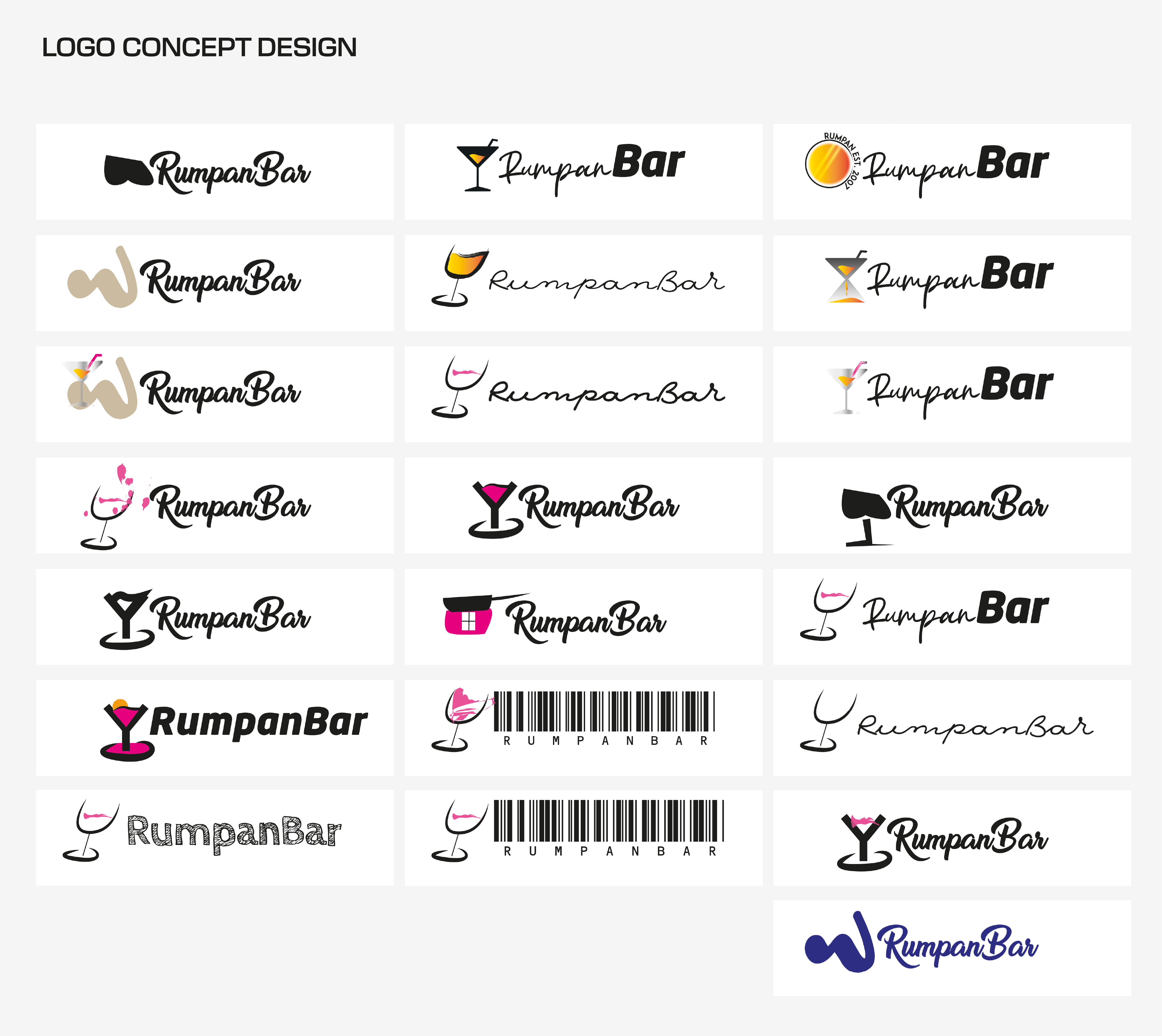
The design process began by using what knowledge I had about the bar, such as it being a pop and rock bar, the client's preferred option for the name (which was rumpan bar) - and combining these with my own research and knowledge about the pop and rock scene. In our initial conversations, we discussed whether "Rumpan" (which translates to "backside" in English) should take center stage in the logo, given the bar's more bold and edgy vibe. With creative freedom in hand, I developed concepts that both leaned into this theme as well as alternatives that took a subtler approach. One design element I felt drawn to was a vibrant magenta pink, which ultimately found its place in the final logo. The initial design proposals can be seen on the left.
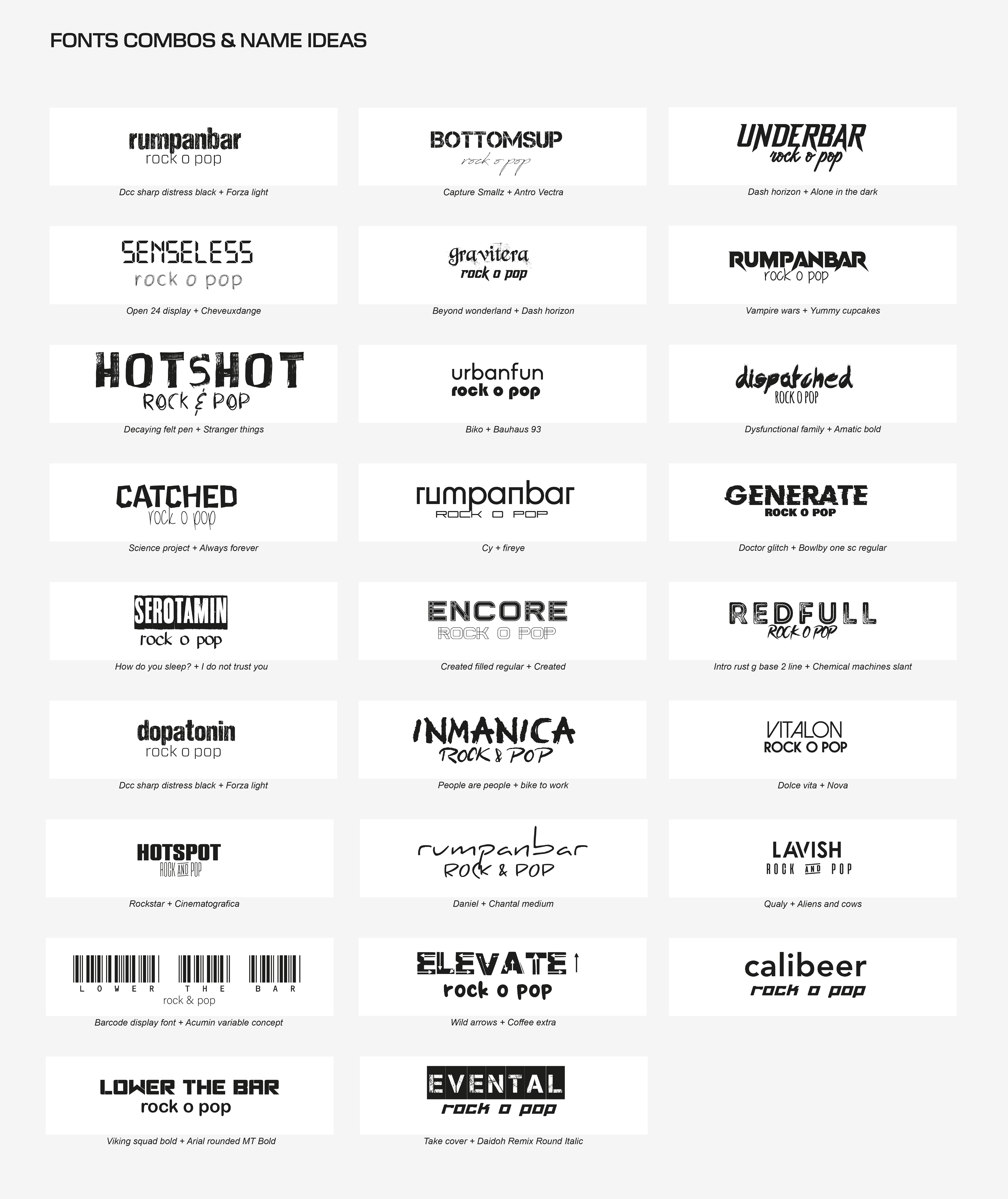
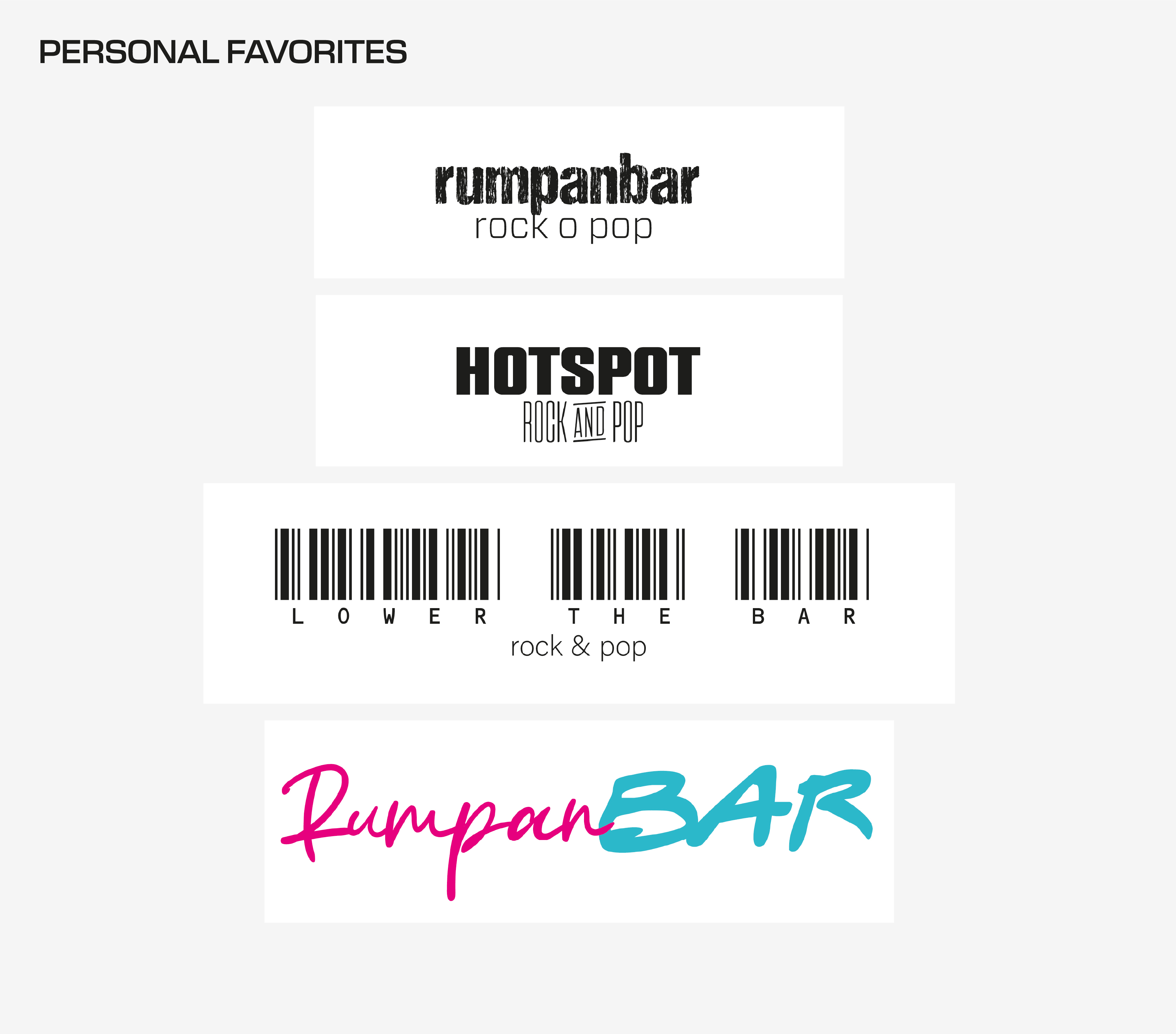
Another part of the project involved suggesting potential names for the bar, as "Rumpan Bar" was not yet finalized. I explored a range of creative directions, from dopamine-inspired concepts to more abstract, unconventional ideas. My personal favorite, "Lower the Bar," incorporates a barcode into the logo, adding layers of meaning. The barcode, a familiar societal symbol, subtly nods to themes of consumer culture—something often critiqued in alternative subcultures—while playing on the phrase "Raise the Bar." By flipping the expression, it sparks reflection on expectations and norms while also serving as a subtle signal to the crowd it wants to attract.

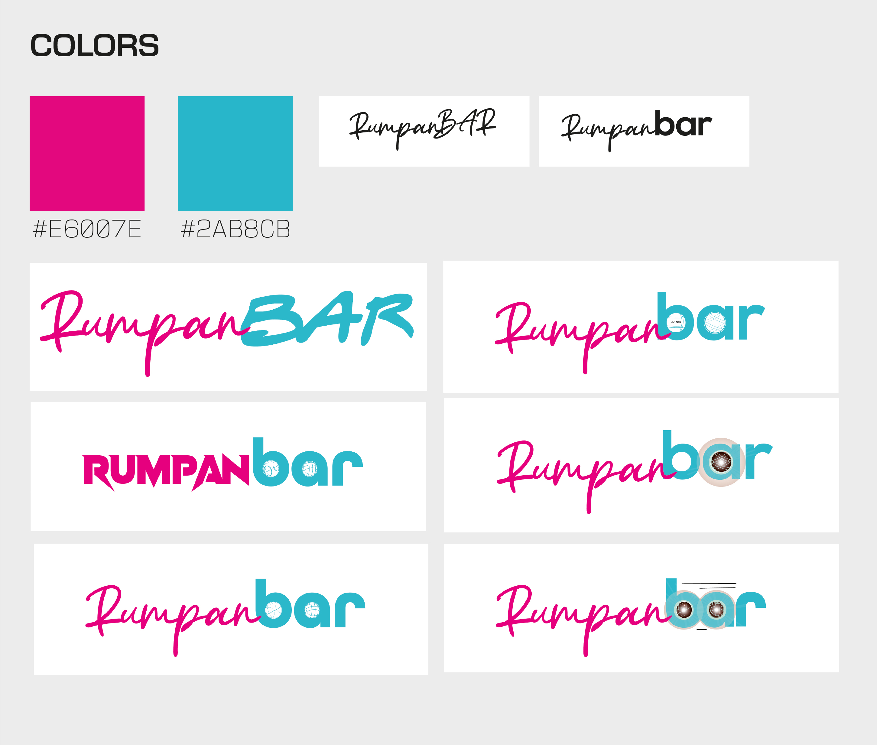
The color palette defined during the design concept phase can be seen below. At this stage, the client expressed interest in exploring how the logo might look with boule balls integrated into the design, which led me to develop these variations. While the logos and concepts I presented were not selected for final use, they contributed to shaping the overall visual direction, particularly influencing the official color palette and typography choices.

