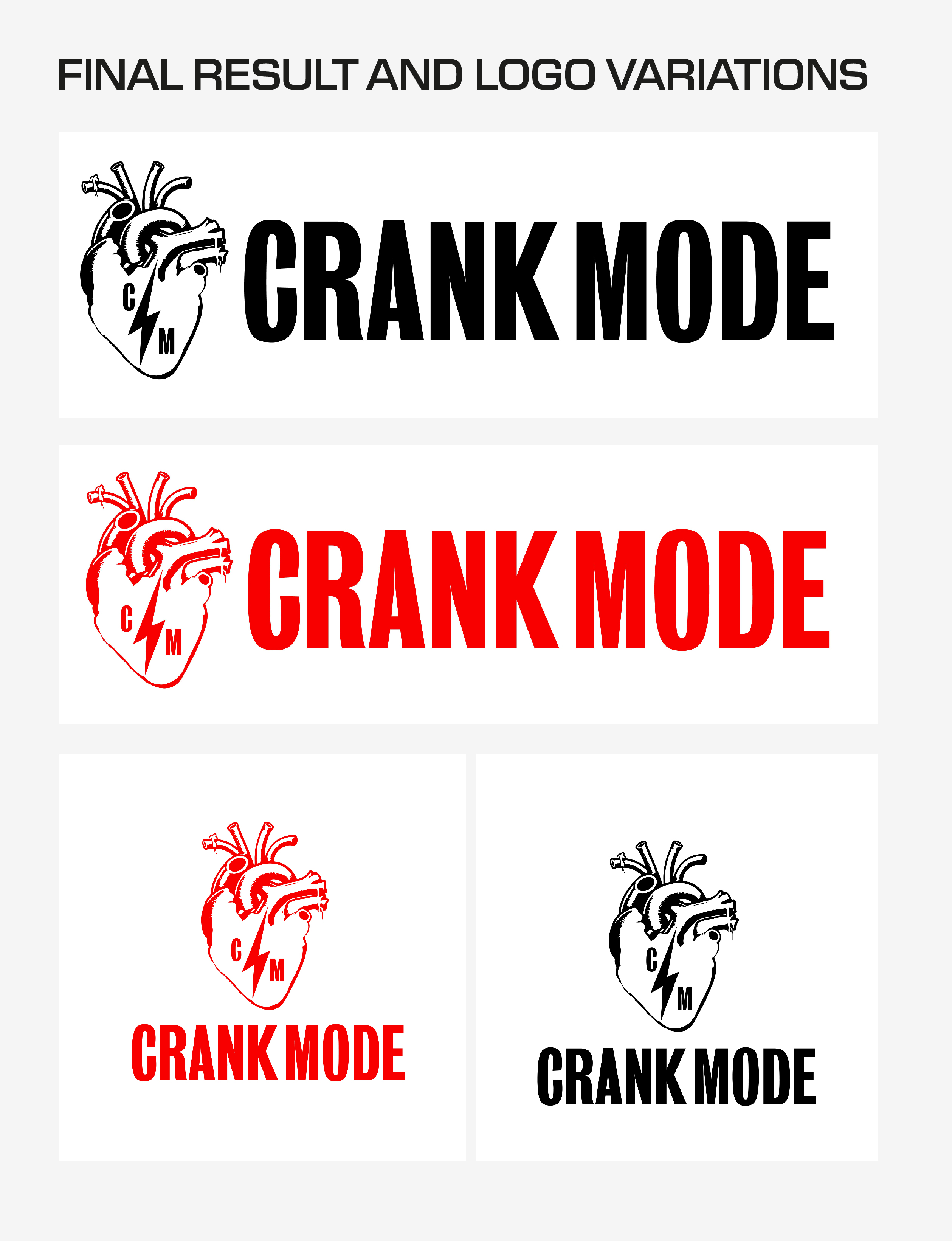
Crank Mode
In 2024, a client was referred to me through a mutual connection, explaining that his friend was looking for a logo for a health, nutrition, and fitness-related purpose. The client had a clear vision for the design—a red, anatomically accurate heart with a lightning bolt through it, where the veins of the heart would be visible in a modern, minimalist style. Additionally, the client requested that the text "Crank Mode" appear beneath the logo, with a mini version of the finsihed logo placed between the words "crank" and "mode." He had already provided a reference image to illustrate his concept, which was incredibly helpful in initiating the design process, as visual references personally assist me greatly in transforming ideas into impactful designs.
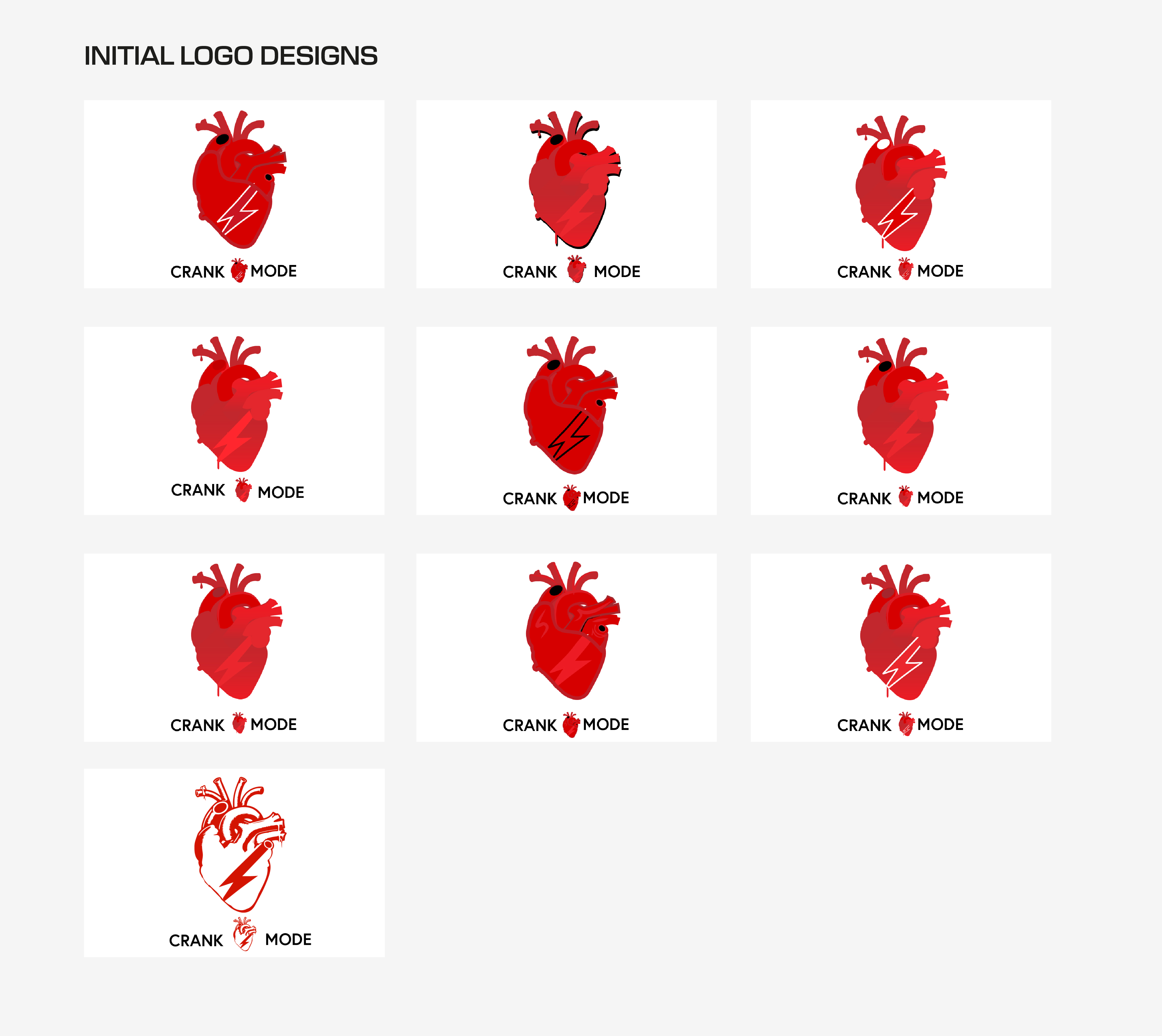
Based on the information I received, I initially developed 10 logo concepts for the client, focusing on exploring a range of styles, intricate details, and creative variations. My goal was to present these options to the client to better understand their design preferences and determine the creative direction for further refinement. The client gravitated toward a line-based version featuring a filled lightning bolt, as seen to the right.
During the initial feedback phase, the client requested several adjustments: the lightning bolt should pass straight through the heart rather than diagonally, a new font should be explored, and the previously requested heart between the words "crank" and "mode" should be removed. Additionally, the client expressed interest in a smaller version of the logo placed to the left with the accompanying text positioned beside it.
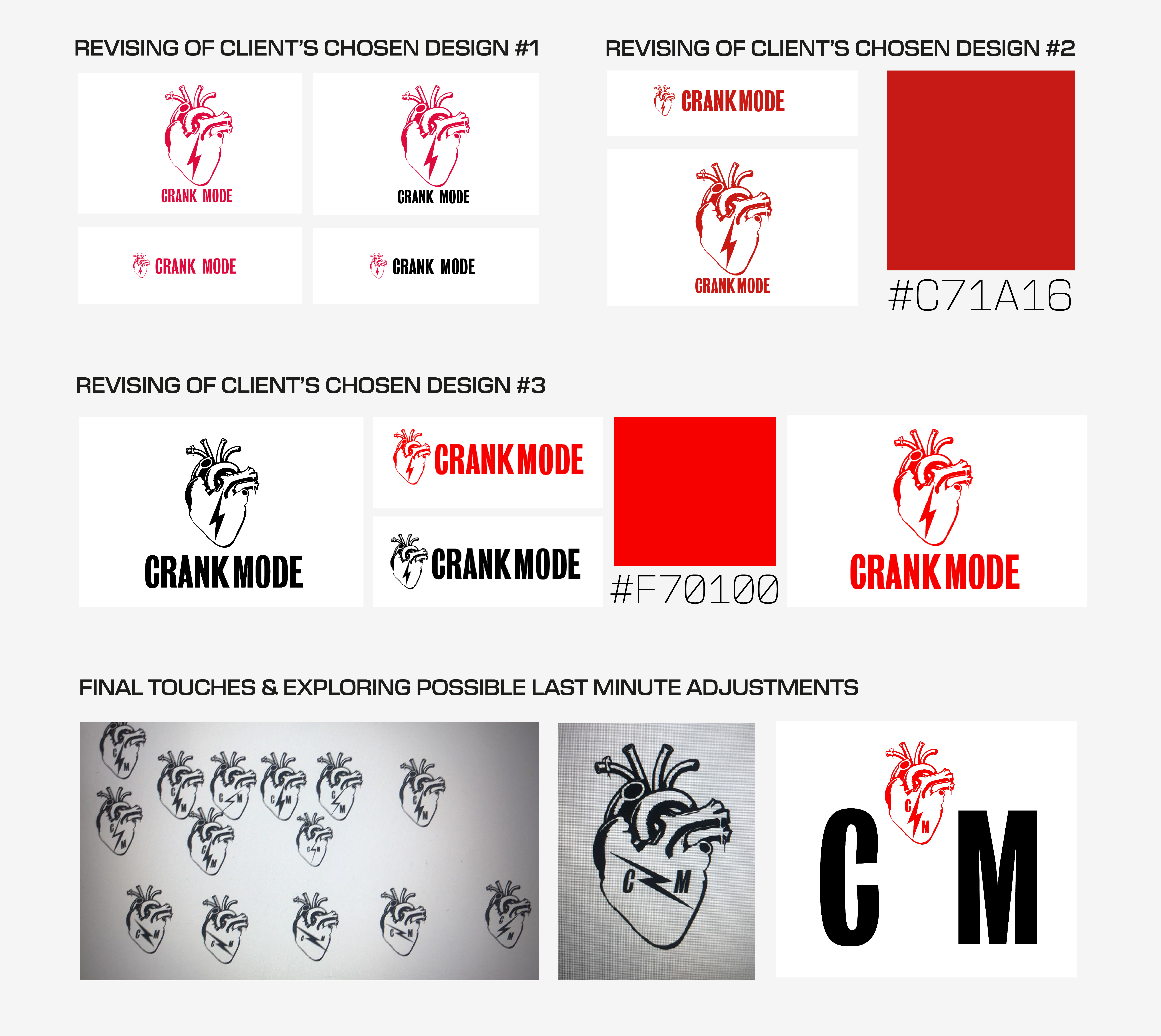
In the second round of revisions, the changes were more subtle but still significant. These included bringing the words "crank" and "mode" a bit closer together, experimenting with new colors the client had in mind, and creating additional variations. The client also wanted to explore different placements of the lightning bolt and to see how the C and M would look positioned on either side of it. Many of the final touches and adjustments were focused on fine-tuning the placement of the lightning bolt and ensuring the C and M were harmoniously integrated into the design.
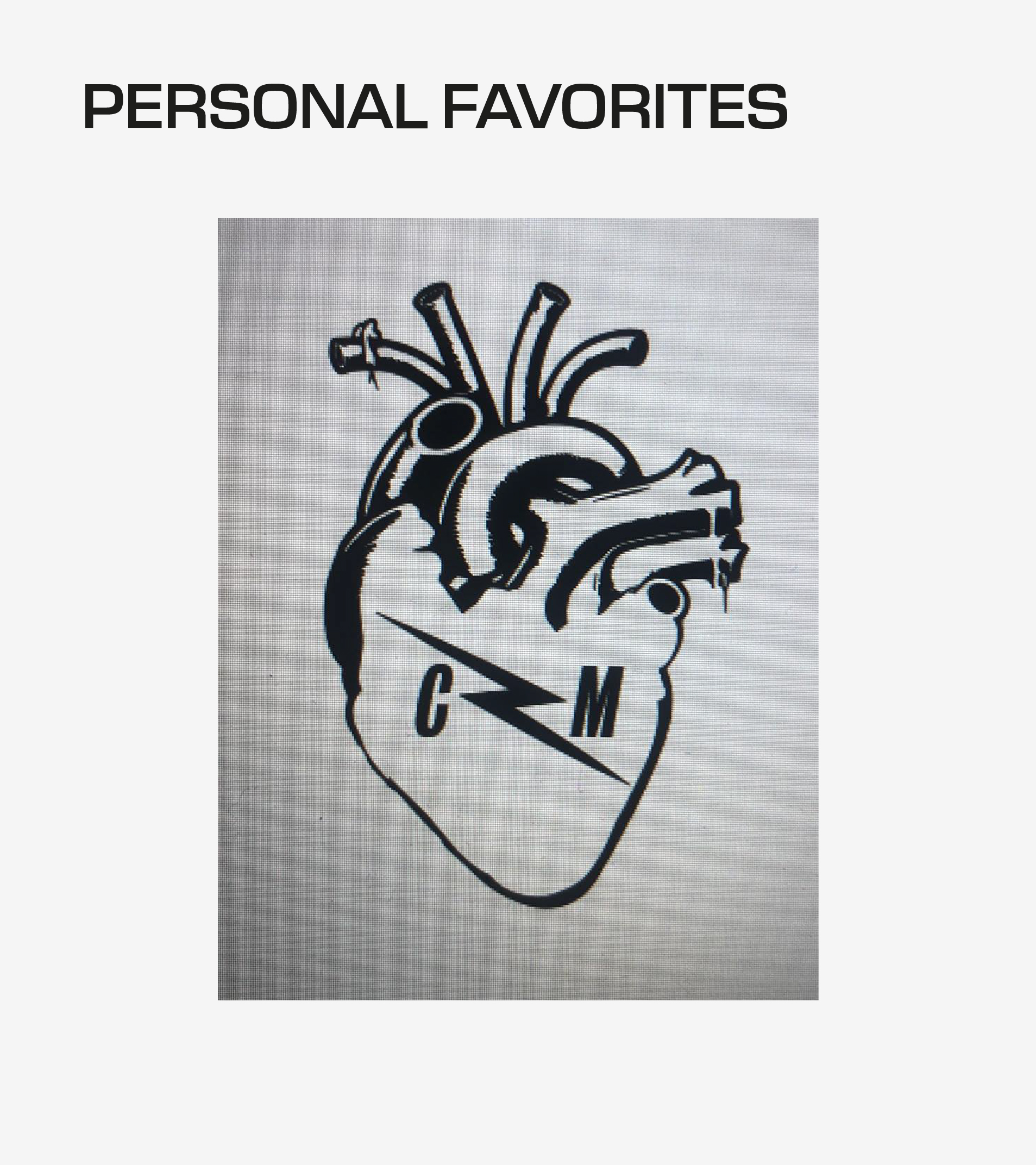
One of my personal favorites was a concept I developed during the exploration of various lightning bolt variations and the visual balance created by the placement of the C and M within the logo. The version shown on the left involved refining the angle of the lightning bolt and flipping its direction, an adjustment I found significantly enhanced the symmetry and distribution of visual weight on both sides of the design compared to earlier iterations. Ultimately, the client selected the version shown on the right, which centers the lightning bolt and seamlessly integrates the C and M into the composition, achieving a cohesive and impactful final design.